Kaydence
Enhancing the design maturity and re-envisioning the agency's visual identity and digital experience.
Senior Designer
Figma, Illustrator, Photoshop, Webflow, Premiere Pro, Lottie, Spline, Notion
K 2.0
As Senior Designer, I spearheaded an internal initiative codenamed 'K 2.0' to address the agency's rapid growth. The project had two primary, sequential goals: first, to establish a scalable design and development framework to increase our operational efficiency, and second, to elevate our brand identity and website to reflect our evolved capabilities.
The Challenge
The first challenge was to overhaul the agency's scattered design-to-development workflow into a scalable, documented system that could support growth. The second was to define and execute a new strategic vision for the agency's brand that would align with stakeholder goals and resonate with a discerning audience of fellow designers. Both initiatives had to be managed with significant time constraints, requiring a balance between internal project development and ongoing client work.


The Approach
Establishing a Scalable Framework
I established a new end-to-end design and development framework, documenting all processes in a company-wide wiki to boost collaborative efficiency and support the agency's growth.
Reimagining the Brand Identity
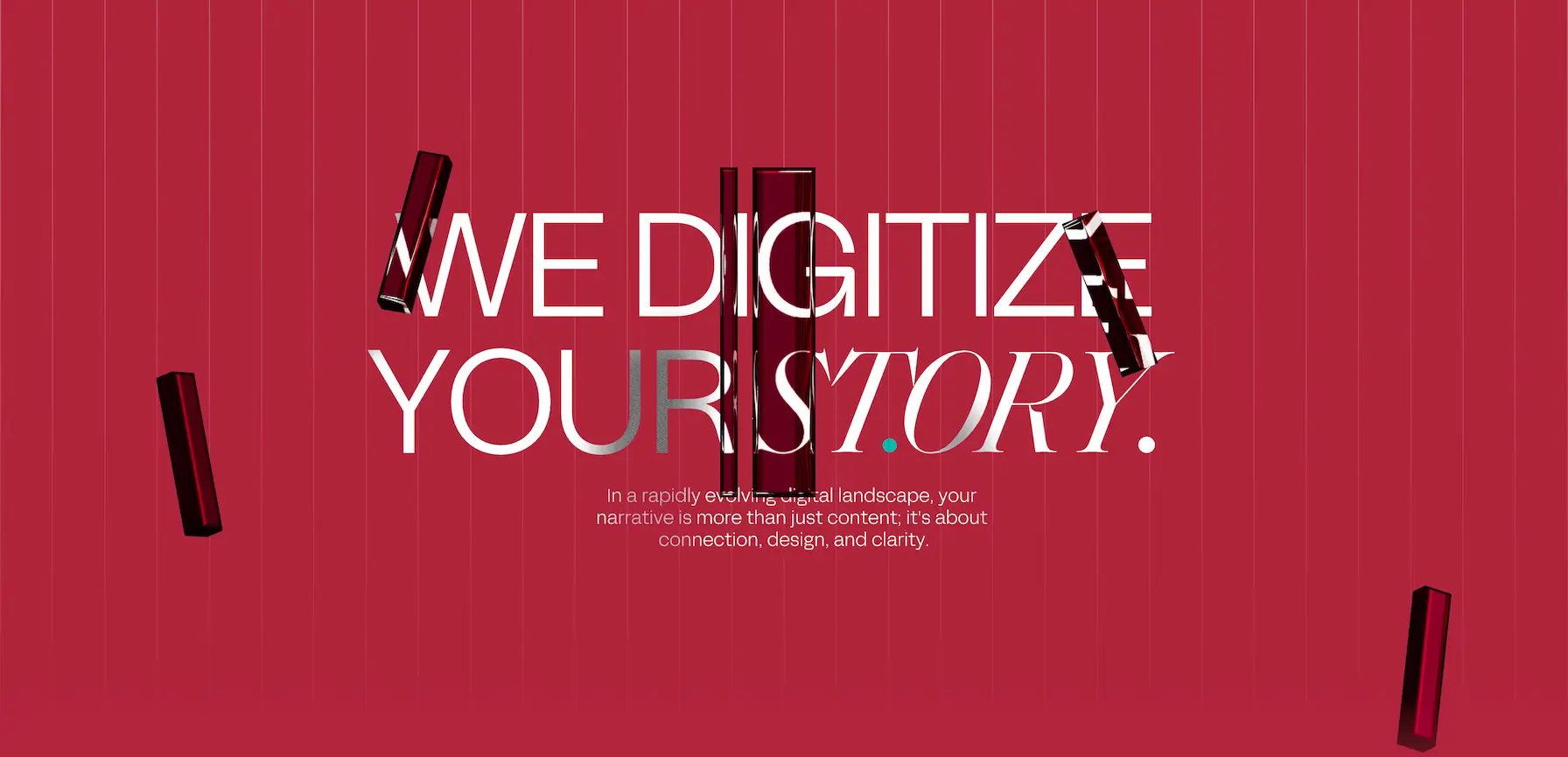
I created a comprehensive brand guide centered on a new musical theme that reflected the agency's creative rhythm, and designed all new visual assets, including 3D elements and custom animations, to bring this new identity to life.
Crafting a New Digital Presence
This culminated in the end-to-end design and development of a new company website, which now serves as the centerpiece of our reimagined digital presence.
316%

Driving design Maturity
When I joined Kaydence, the agency's lack of a standardized process for brand and web projects limited its ability to scale. I identified these gaps and spearheaded the creation of a new end-to-end design and development framework, documenting everything from our brand strategy process to a clear Figma-to-Webflow workflow in a company-wide wiki I established. This new system was the primary driver behind a 316% year-over-year increase in client capacity, significantly boosting the studio's design maturity and collaborative efficiency.
A New Creative Direction
The agency had outgrown its original visual identity, so my goal was to create a new brand that reflected our evolved capabilities and captured our collaborative energy. The new creative direction was centered on a musical theme, representing the rhythm of our design process. I established a comprehensive brand guide and created all new visual assets, including custom 3D elements and animations, to bring this new identity to life across every touchpoint.


Building the New Stage
The final step was to bring the new brand to life with a completely redesigned company website. I owned the entire process from concept to launch, personally bridging the gap between design and development. After creating the visual designs, I handled the front-end development to implement custom animations and interactions that truly reflected our new creative direction. The result is a polished and intuitive web experience that now serves as the central hub for the agency’s brand.


